The Color Roadmap: Your Palette for Success


Color enriches and influences every aspect of our lives; from what we wear to the environments we create. Of course, floor covering is an integral foundation for our environments, and the right colors are critical. The connection between colors we choose to live with, and where we live, is hard-wired, always evolving (of course) but with deep-rooted influences.
It is timely, then, that Color Marketing Group International has adopted a new methodology of developing their color forecasts. CMG now holds regional ChromaZone meetings in key metropolitan areas across the country throughout the year. Designers and color professionals analyze color directions for their part of the country, and based on that collective, nation-wide information, the final forecast is derived and announced at CMG’s annual summit meeting.
The floor covering industry obviously knows how valuable this forecast is in determining their palettes for 2013 and 2014, because they were well represented in Miami this past October. Among the contributing color professionals present were representatives from Mohawk, J & J Industries, Mannington/Amtico, DalTile, Bigelow Commercial Carpets, Centiva, Congoleum, Shaw Industries, Johnsonite and Beaulieu.
I share this with you as validation of the influence this new color information will have on our industry.
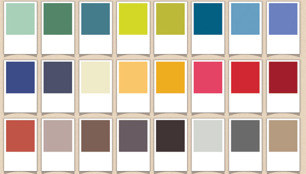
The actual names and color formulas generated by CMG are proprietary to members only, so I have built a comparable reference palette for you here that will give you accurate insights as to the emerging colors.
Let’s talk about the macro-trends that helped forge the color directions for the next two years:
Neo-Geo
There is a radical change in how we view the physical world. Earth has evolved from “clean” dirt and minerals to a stratified mix that now includes bits of plastics, trash and shards of glass. Prints and patterns for carpets will pick up on this new geology concept.
Look for patterns that simulate colorful geodes and stone-like patterns. Contemporary versions will emerge reflecting neo-geo. Yarns with varying luster levels will be combined for interest and colors seem to change with the light of the day. Tactility will be even more important—high texture with a natural look, and (of course) luxurious softness.
Contemporary Minimalism
Design has been moving towards a “less is more” concept for several years now. An austere world economy has moved this to a macro-trend for 2013-2014. We will continue to design around what we “need” rather than clutter our interiors with useless things. Simplification, but with the introduction of even more high-tech comforts, will influence our environments. Ease of maintenance goes along with this trend, and all flooring types will consider this a priority in their product development.
Next Nature
The floor covering industry has done a great job of interpreting patterns (example: organic, botanical, aqueous) from nature into carpet--both broadloom and carpet tiles. Porcelain tile manufacturers have done the same.
Now, enter “next nature” – patterns that reflect a new rendered reality. Natural and virtual will combine to produce fresh new versions of nature. Pixelization, cubed and triangular shapes that look as if they have jumped off a computer screen, will all be interpreted into soft surfaces. Gradiant tones of color (ombre effects) within one carpet or area rug will be available. Tile will also employ these new color techniques. Vibrant colors will be interpreted into luxury vinyl tile with mix and match capabilities, especially useful for contract work (healthcare, education, hospitality).
Past Meets Present
Nostalgic times are looking pretty good to all of us right now. Colors from mid-century are optimistic, and these colors are strongly incorporated in the forecasted palette. Art Deco influences helped shape the new colors as well. In certain regions of the country, colors with historical importance found their way into the palette. These colors from the past bring with them associations of optimism, stability and comfort.
Sustaina-blue
Just about every region in the country agreed that America is pretty “greened-out”. Greens have dominated the palette for the last five years, and we are ready for change. Two years ago CMG predicted that blues would be the new flag-bearer for sustainability, and that has become reality. Even the new greens are touched with blue. Sustainability in design is more important than ever. Re-use, re-claim, re-share, repurpose: this is the mantra for the remainder of the decade.
Now let’s see how these trends brought about the projected colors that earned a place in the new palette for 2013 and 2014:
Greens and Blue-Greens
Julep – Mint Juleps on a hot summer’s day reflect this cool green that has Art Deco roots.
Techno Green– A mid-toned green that works for interiors or exteriors.
Caribbean– A perfect balance of deep green touched by blue. Area rugs will capture this color.
Yellow-Greens
Vibe– Bright and optimistic, this green is a new version of lime and a bit acidic.
Split Pea– Still keeps green on the light side with this mid-toned color.
Blues
Nemo– A velvety blue with enough clarity to keep it lively.
Georgian Blue– Definitely a ‘Past meets Present’ color drawn from Colonial times. A favorite color-to-be, especially in the Northeast.
Tanzanista – This gem-like blue captures the essence of tanzanite. Blue kissed with purple.
CrispinBlu- A deep, thoughtful blue that is peaceful and pairs beautifully with white
Beyond Midnight– Black has been replaced by this color. It’s less stark than pure black and also more interesting.
Yellows
Moonray– A true neutral, this is a warm beige with a miniscule touch of green.
Haystack– Natural, warm and golden in tone with a slight undertone of orange.
Dijon– Yellow goes deep with this hue. The color of pure egg yolks, it’s definitely one of the optimistic colors.
Reds
Luscious– Pinks and reds are important and well represented for the next two years. They reflect health and well being. Luscious has pink undertones and lightens red to a live-able interior color.
Statement– Lipstick red and interiors can wear it with confidence. Great accent color.
Velvet Rose– Picture a freshly painted New England barn trimmed in crisp white.
V-8– Orange is not gone, but reconfigured wearing a coat of red.
Warm Neutrals
Changes – This is the color you’ve been waiting for, a complex mid-toned neutral that harmonizes with just about everything. Every floor covering type will pick up on this color because it is timeless and easy to live with.
Sweet Cocoa – Just as it sounds, it’s a rich, but neutral, brown.
Brooding– Another alternative to black, Brooding is deep and grounded, but with a touch of brown.
Rich Brew– Even darker than Brooding, black has some new competition.
Cool Neutrals
Whisper– Gray is stepping back from its current huge presence in interiors. But Whisper represents gray well, with a ‘whisper’ undertone of soft green.
NeoGeo– Not black, not gray, not green, it’s a blend of all three producing a chameleon color that is mineral-like.
Metallic
Metallica– We are all ready for a new metal color that hasn’t been overdone. Metallica is a hybrid that defies an accurate label. Picture bubbling champagne that is a no-color color. Special finishes with color flecks will give it glimmer and substance. Carpet manufacturers will enjoy playing with this color and varying luster levels. Tile and LVT manufacturers will love it as well.
Since these are emerging colors, you will see some new product introductions wearing these hues in the very near future. If you are fortunate enough to attend Surfaces 2013, be on the lookout for them in resilient, hard surfaces and carpet. It’s exciting to watch colors of the future come to life before your very eyes.
Most of these colors won’t appear until later in the new year or into 2014, but they are on the way. The forecast colors bring energy and a message of new beginnings to interiors. The new color harmonies that can be created are a break-away from what we’ve seen the last few years. The muted, grayed-down colors are waning and making way for crisp, clean hues.
It’s all about new beginnings, and colors will be our roadmap to the future.
Annette Callari is a highly regarded interior design and color expert with over 24 years of residential and commercial design experience. She currently serves as sales specialist for Amtico International in southern California, working with architects, designers, and key retailers. She is an allied designer with the American Society of Interior Designers, chair holder for Color Marketing Group International, and has authored numerous articles on color and design trends.
You can reach her at
Looking for a reprint of this article?
From high-res PDFs to custom plaques, order your copy today!


