Strategies for Successful Showroom Design

For end users/consumers, displays are meant to provide ideas on the types of uses a product has and inspire new applications that they might not have considered.
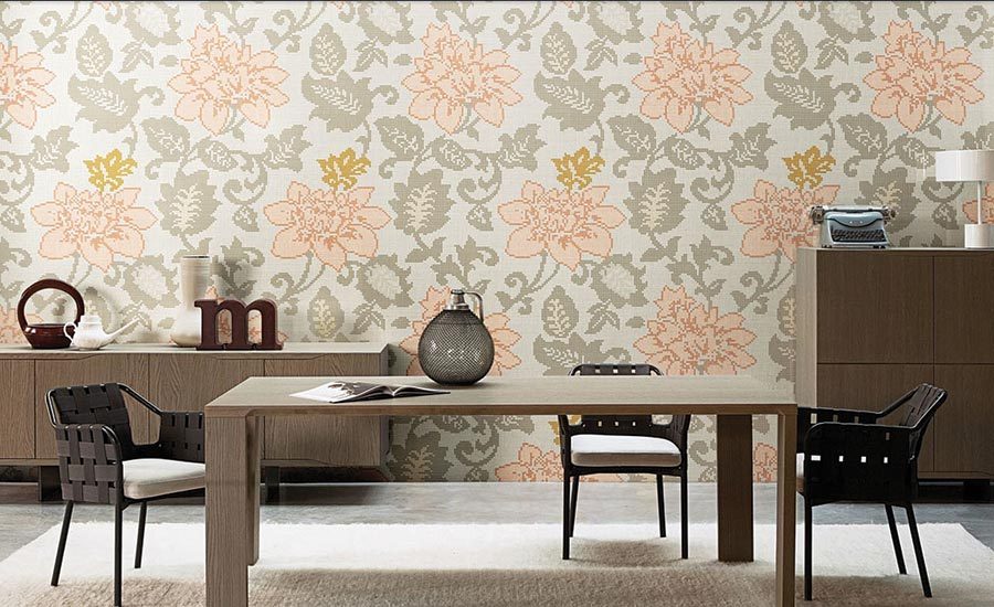
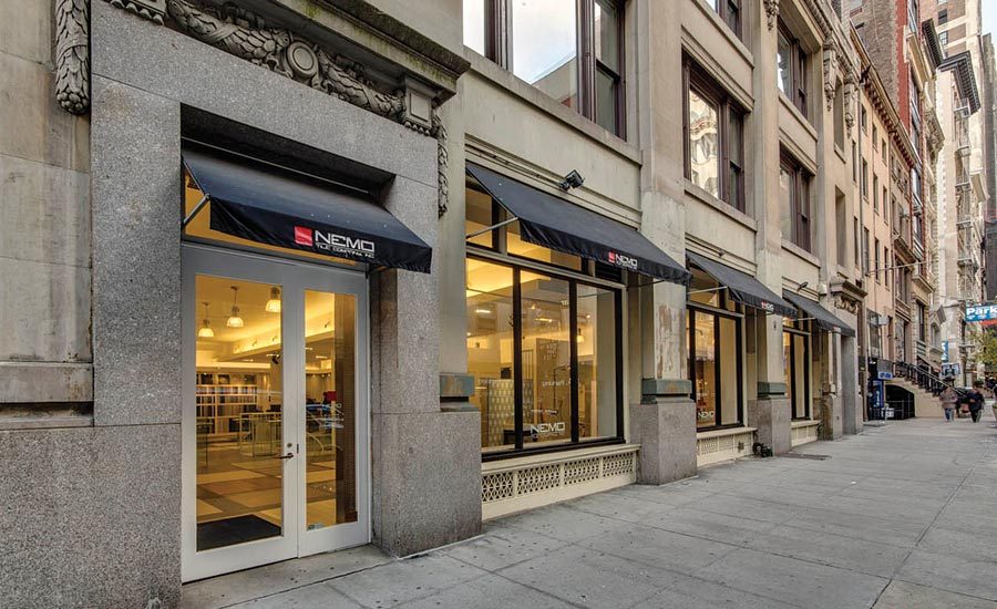
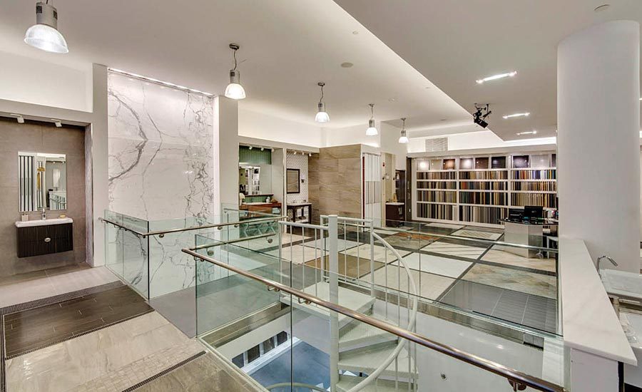

Sample boards should be organized by use and type so it’s easy for the consumer to compare and contrast.


A beautiful and thoughtfully designed showroom is inspiring and creates a tactile environment for shoppers. As a key component in the storytelling of a brand and highlighting its newest offerings, the showroom design is vital. If designed well, a passerby is more inclined to walk in and eventually make a purchase after feeling, seeing and experiencing the product first hand.
Katie Michael-Battaglia, design director at Nemo Tile, understands the process of creating a showroom that speaks to the target audience, displays product properly and drives potential buyers and designers inside. Since joining the 95-year-old tile and stone distributor in 2015, Katie has renovated Nemo’s original Manhattan showroom while designing new ones—Nemo will be entering the New Jersey market with a new locale in Monmouth County, which opens in early 2017. She has also redesigned the Philadelphia showroom, which is housed on the second floor of a building that lacks curb appeal, but still draws ample foot traffic. Not to mention, Michael-Battaglia is a former designer at Gensler as well as a past president of IIDA NY. We connected with her to discuss some of her key strategies to designing a winning showroom.
FT: As a designer, how do you initiate a design that speaks to your target audience?
Michael-Battaglia: My approach is to get inside the minds of the target audience, which varies from location to location, to fully understand what they aspire to have and their goals for their project. I try to look at what they are trying to achieve, and understand their lifestyles, which is incredibly insightful. There should be a mix of options provided that directly meet their intended needs, while also offering up a plethora of design options that push boundaries and offer additional possibilities that may not have been originally considered.
FT: How does curb appeal influence shopper perception and entice them into a showroom?
Michael-Battaglia: When we have a showroom located on the ground level with windows that allow customers to peek inside, such as our new showroom in Red Bank, N.J., set to open early this year, the idea is to design the space in layers. It’s key to keep the showroom layout open enough so that shoppers/customers can take in the entire space as well as experience the breadth of products in a setting that is not crowded with displays or too busy to explore. You should also keep the walls shorter in the front to allow views of the showroom that go beyond the entrance. The product placement in the front is meant to grab people’s attention and entice them to enter, so this showcase needs to be both beautiful and unexpected. Though sometimes it may be a product or setting that they may not end up using, it helps capture their attention and draw them in for further exploration.
FT: What are some key strategies for creating an enticing showroom entrance?
Michael-Battaglia: I like to make sure that the entrance has open space. There shouldn’t be anything that blocks views or encumbers potential customers. Another key element is lighting, which sets the mood. For Nemo Tile, we try to create an environment where everyone feels welcomed and also inspired. The showroom is a place for them to utilize and hopefully feel stimulated and encouraged by new design ideas—not just a gallery.
FT: How does architecture help to guide the showroom shopping experience, and what architectural features and showroom layout do you use to guide that experience?
Michael-Battaglia: I like to layer a space. It’s important to have openness and not make visitors feel too closed in, or that they can’t see one area of the showroom from another. We need to create spaces that emulate one’s own home or office, and showcase settings that appeal to our customers. In our Nemo Tile showrooms, we incorporate bathroom vignettes so that customers can relate to the product and get an idea of how a specific tile can be used. To mix it up, I will mix in other settings one might find in a home to further make that connection to the shopper.
FT: Does the strategy change for design professionals vs. consumers?
Michael-Battaglia: Absolutely. I have designed showrooms for both design professionals and consumers. When the target is design professionals, they are interested in seeing the materials as large as possible. I recommend keeping it clean and easily changeable so the designer can see how multiple materials can come together. For end users/consumers, the displays are meant to provide ideas on the types of uses a product has and inspire new applications as well as product variety. Displays need to be designed to satisfy the needs of both types of consumers. Most of Nemo’s showrooms are designed for both design professionals and consumers, so our spaces reflect a mix of both.
FT: How does merchandising help to simplify the selection and buying process? What strategies do you use to organize product?
Michael-Battaglia: With tile and stone, the product itself can dictate what is suitable for certain areas. Not all products can on go on floors; however, most products can be applied to walls. The selection process focuses mainly on what we are introducing and our new products, as well as how best to showcase these collections—by themselves or in conjunction with other product collections. We like to mix the lines to show variety and showcase how products can be mixed.
FT: How important is signage?
Michael-Battaglia: This is something we have been playing with lately as we plan for the opening of our new showroom in Red Bank. I prefer not having signage or labeling on all the materials, as it sometimes takes away from the experience. With an abundance of signage, you tend to feel like you are in a retail chain store and risk cheapening the experience. However, we do have pull-out boards with the materials displayed showcasing the breadth of the line. These displays go a bit further—they highlight the entire color story and sizes available.
Signage for brand identity is very important. We label all samples and our binders are branded as well, which helps reinforce the Nemo Tile brand. Having previously been a designer in large commercial design firms, I know from firsthand experience that if you find a sample and there isn’t information as to where it came from, it gets tossed. Information has to be clear for those wanting to specify the product.
FT: What inspirations or best practices from successful retailers in other consumer categories are inspiring your showroom designs currently?
Michael-Battaglia: When I see other showrooms with clean, simple and well-detailed display systems, I feel inspired. It’s all about the product! As a designer, I look at the details, the lighting and the layout. I love going to trade shows because they provide the opportunity to see settings and displays that are meant to draw someone in, even in an environment where everyone is trying to achieve the same level of appeal.
FT: What showroom design tips can help speed up the consumer’s selection process?
Michael-Battaglia: The key things to keep in mind are organization and keeping like materials together, which helps clients see how different products can mix and mingle. I had mentioned pull-out boards and these should be organized by use and type so it’s easy for the consumer to compare and contrast. For example, at Nemo Tile, we have all the glass tiles together, all the wood porcelain together, and so forth.
Additionally, having samples available that can be pulled so consumers can see a complete palette is also very important.
Looking for a reprint of this article?
From high-res PDFs to custom plaques, order your copy today!


