Carpet Color Trends: Cool Neutrals Hot on the Market


Article Index:
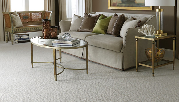
“Soft neutral tones lend a feeling of sophistication to home fashion applications,” said Nathan Hammett, Mohawk Industries’ manager of color and design, residential.
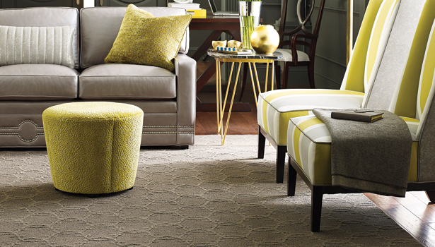
Standing out in that category of popular neutral shades are variations of gray and taupe, according to various color and design mill executives.
“We felt like this was the year to name our Shaw Floors’ Color of the Year ‘Lady in Grey,’” said Emily Morrow, Shaw’s director of color, style and design. “All the indications that we have seen through our international travels and international markets—not just floor covering—but all of the bigger pieces that you have to look at to see what those indicators are, point to gray being here for quite some time.”
According to Hammett, gray’s importance in the carpet industry goes far beyond it being a single color, but an influence on neutrals in general. “We’ve witnessed an obvious movement toward taupe and other earthier neutrals.”
With the ability to be easily paired with bold accent colors and other flooring categories, these complementing neutrals serve as ideal hues to add both warm and cool effects to transform interior spaces.
“Warm gray tones and neutrals that play well against bold accent colors are popular,” said Susan Curtis, Phenix Flooring’s vice president of marketing and product development. “Taupe is on the horizon, as it varies in hue and works well with many wood and stone colors.”
Although neutral colorways are the forerunners of today’s carpet shades, they continue to share the spotlight with bright accent colors in the broadloom sector.
“Overall, sophisticated neutrals will dominate floor covering. However, there is still space for vibrant and positive colors as bold accent statements,” said Laura Roman, director of design for Milliken’s floor covering division.
In applications where vivid colors are used as accessories, they can be balanced or toned down with the backdrop of coordinating neutral shades.
According to Roman, oranges, purples and soft muted blushes with red undertones are especially on trend this year for vibrant accents. “Contrasting colors are popular right now—from furniture, fabrics and carpeting. For example, a gray chair piped in a bright accent color for contrast and intrigue. With a teal carpet, you might incorporate a plum edge, and you might see a bright orange edge with a taupe carpet.”
The Rise of Trends
Manufacturers are quick to note popular carpet colors are derived from every day places and things—from the high-end designer runways at New York Fashion Week, to lifestyle magazines and media outlets.
“Thought leaders in interior design and decorators, as well as editors of design magazines, shelter books and blogs influence color popularity and determine the hot color combinations, which influence floor covering designers,” said Melvin Silvers, president of Dream Weaver. “Consumers looking to do a home or room makeover are influenced by that.”
At first glance, one might not think what’s seen on today’s fashion runways has an influence on carpet color trends, but carpet manufacturers said the correlation is often derived there.
“Color and design trends are constantly evolving. Normally they are first observed in the upscale apparel industry, and then are brought into home fashion applications,” said Hammett.
Ginny Jones, senior designer for the Milliken floor covering division added, “Both aesthetics and functionality determine popular carpet colors. With all the beautiful floor coverings available today, the floor has really become a fashion item.”
Shaw’s Lady in Grey, speaks to the influence color trends in fashion can have on the carpet and interior design industries, Morrow noted. “In 2007, we saw Christian Dior launch its entire fall collection in gray. That was the first period we’d seen in gray. The following year, we started seeing the color in designer show houses and higher end design. And then we started seeing it work its way into everyday fashion and pieces. It then trickled down into flooring.”
From Region to Region
“There is never a hard cycle to carpet color, it evolves organically and in response to social global trends,” said Curtis. “Generally there is a lot of overlapping of color as it incorporates new influences and migrates over time. Some trends have longer runs while others are short lived yet impactful—pushing aesthetics to a new level.”
Although trending carpet colors are ever changing and evolving—be it seasonally, annually or beyond—regions across the U.S. tend to see their own trends in color due to functionality, tradition, climate and culture.
“Even though most people respond to color, we each have different backgrounds and cultures, which means we all see and appreciate color differently,” said Hammett. “The Northeast has historically been a better market for jewel tones or other non-neutral color palette, while the West Coast has a preference for soft, light, neutral tones.”
From the Runway to the Showroom
With the help of social media and interior design television shows, today’s consumer has an idea of what style and color of flooring she’d like in her home before she steps foot in a store.
“Social media is an immediate way to reach out to consumers, before they come into a showroom. They can participate on Pinterest, Facebook and Instagram—just to name a few,” said Morrow.
From that point, it is then up to the retailer to help her see exactly how a certain type or color of carpet can work—both functionally and aesthetically—in her space.
According to Silvers, when it comes to helping consumers choose an ideal carpet color for their home once they make it into the showroom, retailers can start this process with a basic, tried-and-true carpet sample. “If showing color is important, a cut size sample remains the best way to show color choice.”
Going one step further, retailers can showcase a product in a display area by incorporating home furnishings or story/display boards. “Vignettes, which pair floor coverings with other areas of home fashion such as fabrics, wallcoverings or window treatments, give the consumer a way to visually appreciate how all these items can work together to create the desired effect in their home,” explained Hammett.
Manufactures like Shaw are taking things up a notch with interactive design apps to help consumers incorporate today’s trending carpet colors into their homes virtually.
“In the palm of their hand, a consumer or a retail sales associate can upload a picture of anything—a room in their home, a piece of fabric they fell in love with or a picture from their vacation to Paris—and our Floorvana app will collate Shaw products from all or specific flooring categories to provide a matching color palette,” said Morrow.
But, aside from apps, display boards and samples, retailers and sales associates have to be knowledgeable about the products they carrying, she added. “Sales associates should be better versed in design and color trends. They don’t have to be the experts, but at least be brushed up on design and color to help them sell. It should become less of a conversation about price, and more about design or fashion itself.”
Looking for a reprint of this article?
From high-res PDFs to custom plaques, order your copy today!



.jpg?t=1690771780)
