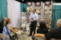
A full-size store re-creation on the show floor at Carpet One's winter convention gave many members their first up-close look at Destination: Carpet One. For many on hand, their only question was: "How soon can I get this in my store?"
The highly anticipated Destination store redesign program is aimed at elevating the aesthetic and functional layout of the store. The anchor is a "power aisle" that separates the showroom into hard and soft surface sections and encourages customers to shop the entire store. Also prevalent are 5-by-5-foot flooring grids to better showcase the more popular styles.
According to Theresa Fisher, vp of store design and visual merchandising, the new design gives members a more unified appearance while encouraging walk-in traffic. In addition, she says, the new look can even raise salespeople's spirits.
"One of my members told me he used to have a hard time recruiting salespeople," says Fisher, who oversees the Destination program and acts as a liaison between the designers and the members. "He told me that because of the redesign, people are coming in asking for applications. Morale and sales are way up. He's really proud of his store."
Fisher says 65 stores have signed on and 28 have completed the remodels in the two years since the program was launched. She adds that the stores that were made-over have reported solid increases in store traffic and sales. The renovated stores also help build the Carpet One brand and create a consistency of appearance regardless of the stores shape or size, she adds.
"In the world of flooring retail, not everything is created equal," Fisher explains. "There are little stores, big stores, one-level, three-level, rectangles, doglegs-the whole nine yards. So we needed one program for all these configurations that would create a branded identity for Carpet One."
To help implement the program, Carpet One called on the Cincinnati design firm FRCH. The first step for each project, says FRCH senior team leader Scott Frazier, is to sit down with the store owner and determine their specific needs.
"We bring in the standard material-the color palette, the power aisle-but we also have to have a great deal of flexibility," says Frazier.
Frazier notes that the size of the store is always an important consideration. Among the 50 or so stores FRCH worked on last year, the smallest was about 1,500 square feet while the largest was around 9,000 square feet. Merchandising considerations can also vary because some stores carry lines not stocked by others. And while most of the work is focused on the floor and walls of the store, the height of the ceiling is another important point: the eye catching banners used in the Destination concept require ceilings at least 12 feet up from the floor.
Once the store concept is finalized, the renovations begin. The first Carpet One retailer to complete the makeover was Aggieland Carpet One in College Station, Texas. Owners Ron and Claudia Smith say they were thrilled with the results and impressed by the sensitivity the design firm demonstrated.
"They were just awesome, very talented people," says Ron Smith. "They didn't just come in here and say ‘This is the way we are going to do it.' They sat down with us and included us every step of the way. They even took care of our non-Carpet One displays. They drew it out and they did what they said they'd do-down to the inch."
He notes that the process served to reinforce the importance of being part of Carpet One. "On my own, I could never afford what they did for us," Smith says who adds that sales jumped 30 percent after the remodeling was completed.
Fisher says the Destination concept is still being rolled out. She hopes to sign up 25 members at the convention in Toronto.


